When Toronto-based designer Sabrina Albanese was asked to design a show home in Keswick, Ontario, she was thrilled. “The home’s location near pretty Lake Simcoe and its spacious 3,000 square feet appealed to me,” she says. “It was built with young families in mind, so I wanted to create a space that was casual and elegant with modern details and playful touches.” Read on to see how she turned a plain space into a tempting abode that anyone could imagine living in.
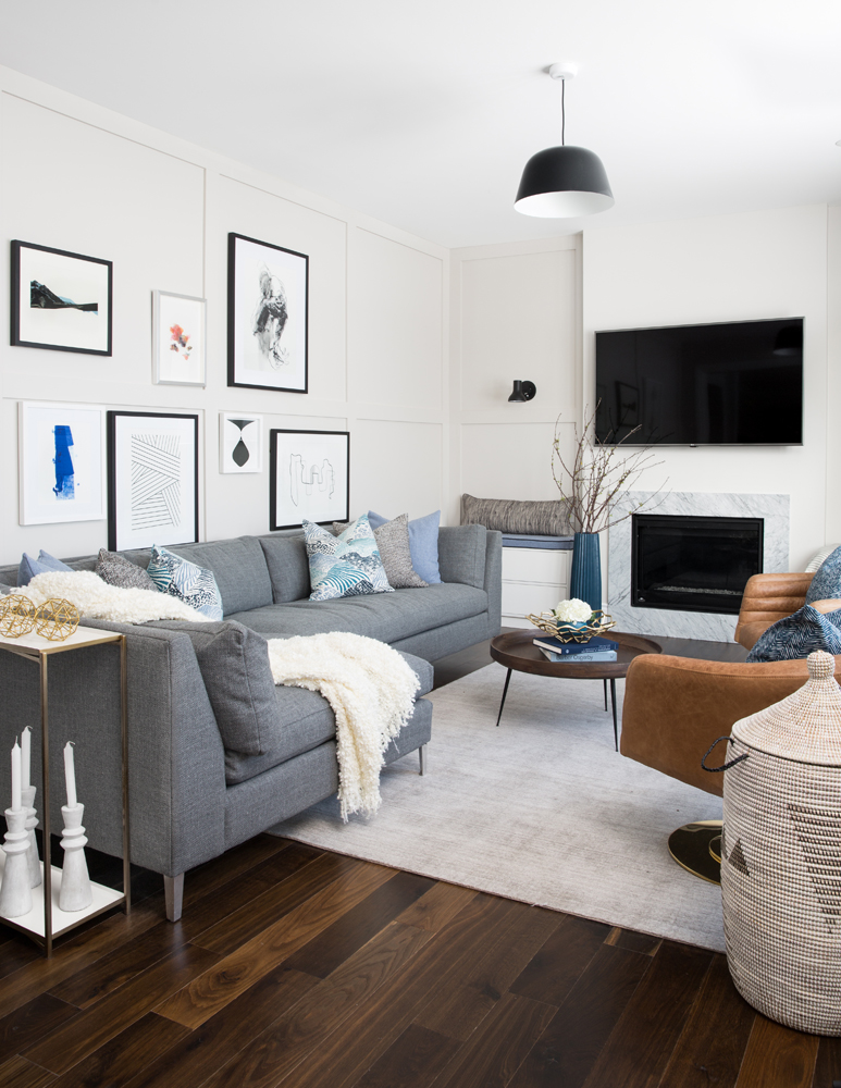
Modern Family
“This family room is the entertaining hub of the home,” says designer Sabrina Albanese. “I wanted it, like the rest of the space, to be comfortable and feature modern detailing. I chose a foggy beachy palette for paint and furnishings, and added the Shaker-style panelling to the walls.” It’s a detail that packs a punch, and we love how this simple DIY project creates such architectural interest, especially when augmented with artwork.
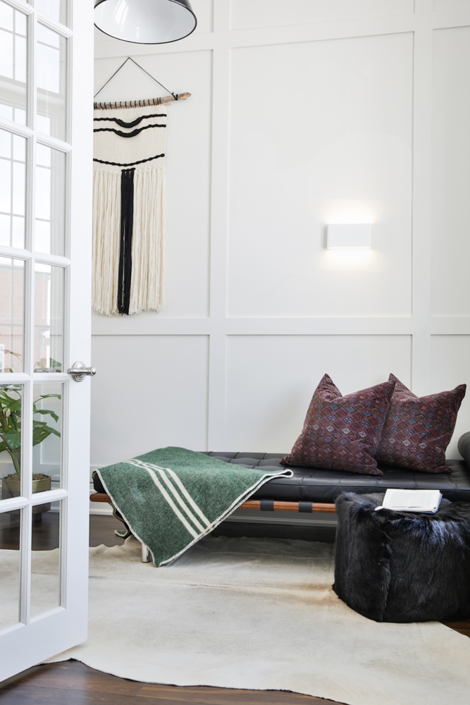
Zen-Like Den
Sabrina gave the den a restful countenance with this stunning chaise. “There is a desk here (not shown) but the chaise provides the option to lay down with a book and also offers additional seating for a professional who works with clients at home.” The panelled walls are juxtaposed with soft furnishings. “The macramé adds warmth, whimsy and personality, and I just love the texture of a hide rug.”
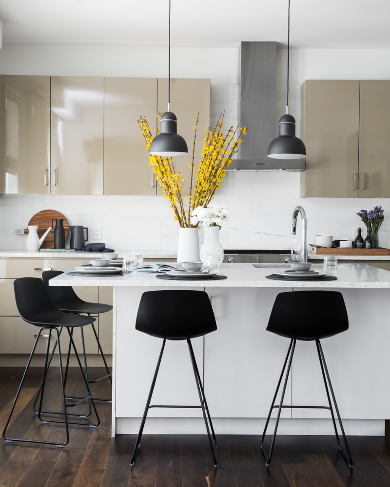
Warming it Up
The high-gloss finish isn’t the only gorgeous thing about this kitchen’s cabinetry. “The taupe is a warm detail that balances the neutral greys and warm whites I used here and throughout the home,” says Sabrina. Black pendant lights and stools keep the contrast lively, and flowering branches add cheerful colour.
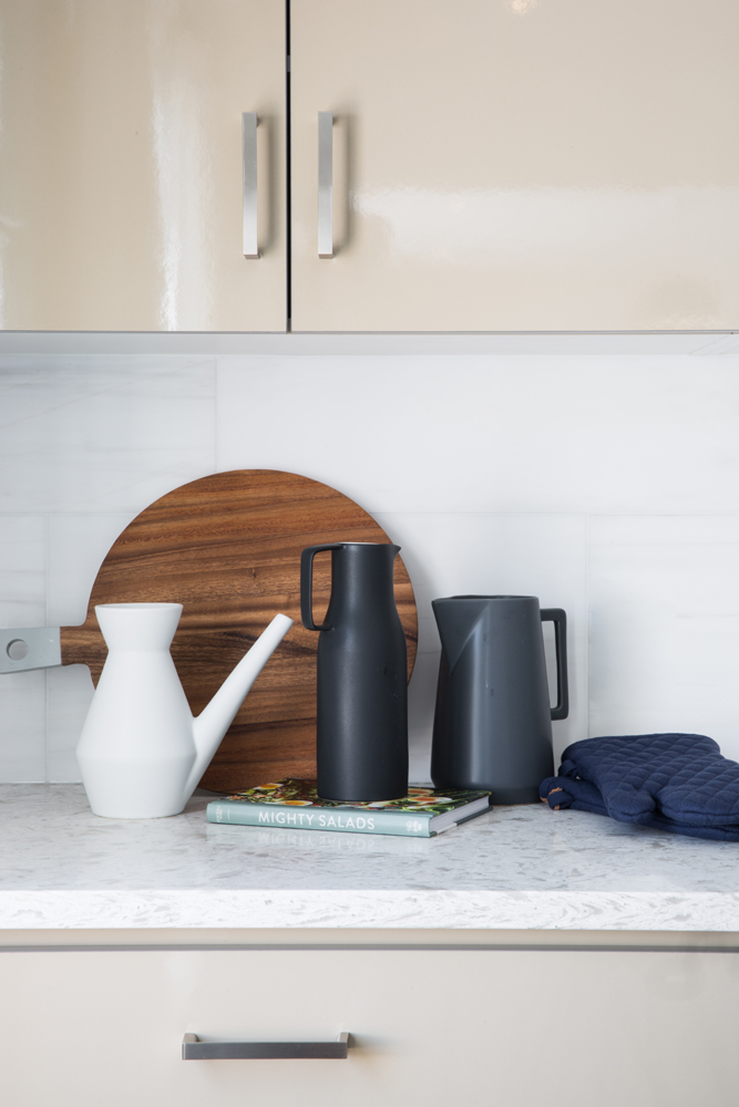
Good Ingredients
Just as any good recipe starts with good ingredients, so too do great kitchens start with great accessories. We love that these black and white jugs speak to the contemporary mood of the home yet have pure organic shapes and are completely useful. The round wooden board furthers that natural and practical appeal.
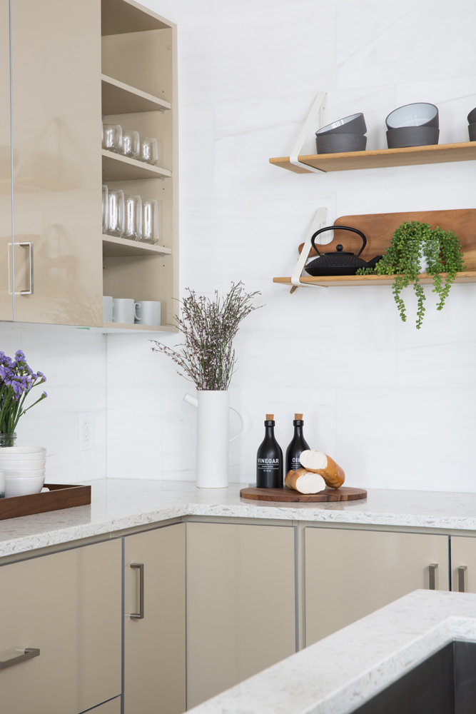
Around the Corner
Sabrina chose quartz countertops in Sea Pearl for the kitchen counters and married it with a to-the-ceiling marble backsplash. “Together these materials look so clean and divine,” she says. We like the use of open shelves in this corner and how they break up the flat-front cabinets.
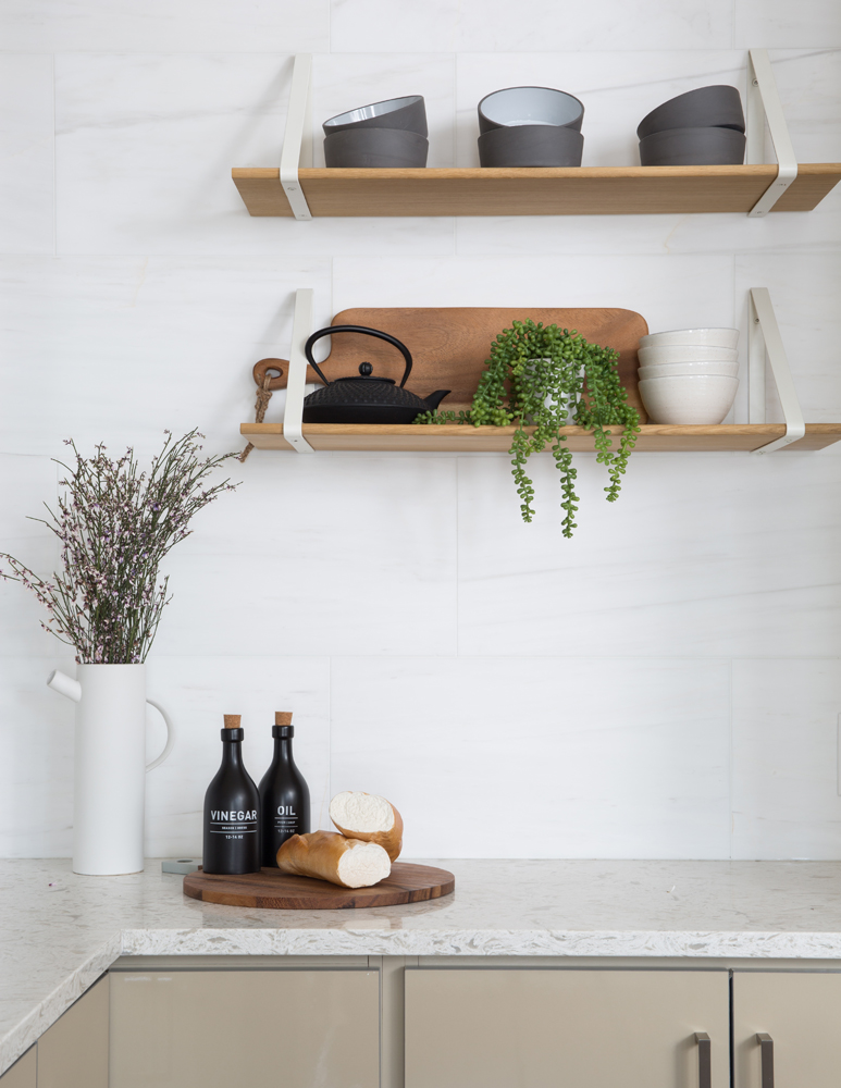
Wood Lot
The juxtaposition of wood against the cool marble and man-made quartz creates a wonderful tension that just adds to the appeal of this contemporary kitchen. “The floating shelves are from Fern Living,” says Sabrina. “They help convey that casual elegance I set out to create for this fantastic space.”
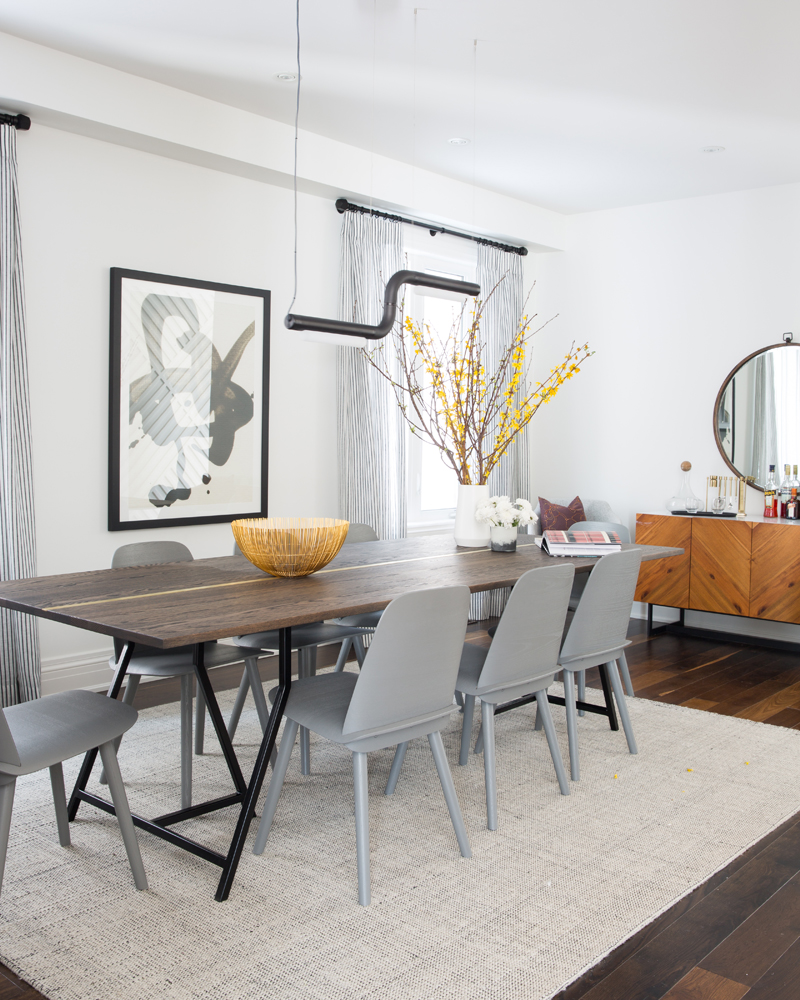
Bringing it to the Table
The dining room is the main space for family meals and dinner parties, so the table had to be more than just a place to eat. “I custom-designed it in oak and added a brass inlay that runs down the centre,” says Sabrina. To keep that desired modern look, she paired it with grey chairs from Design Within Reach. The directional light fixture, which seems to float on air, is a homegrown stunner from Vancouver-based ANDlight.
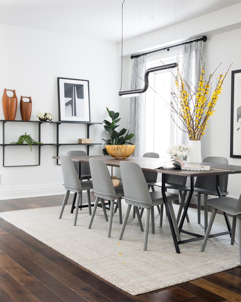
The Art of Entertaining
Sabrina echoes the feel of the Canadian-made light fixture with a contemporary wall unit that displays decorative objects and artwork. “The black and white art resting here and hung on the wall act as great focal points that fuse all the room’s accents together,” she says.
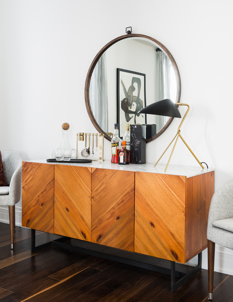
Mixing it Up
This end of the dining room has an almost vintage vibe thanks to this credenza. We love the way Sabrina tempered its warm wood tones by framing it with cool-grey chairs that play off its marble top. “The mirror and lamp above it are functional and stylish details that both enhance and practically accessorize the space.”
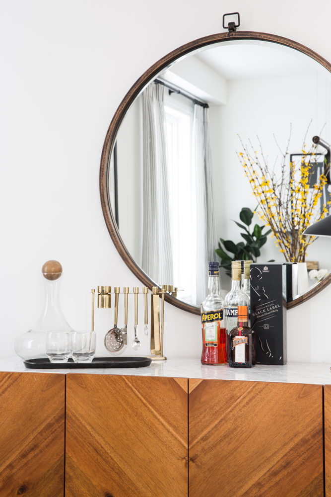
Bar Code
As well as providing stylish storage for dishes and tableware, the credenza serves as an elegant bar. We love that the bottles are on display (not hidden behind the doors below) and accessorized with snazzy burnished brass utensils.
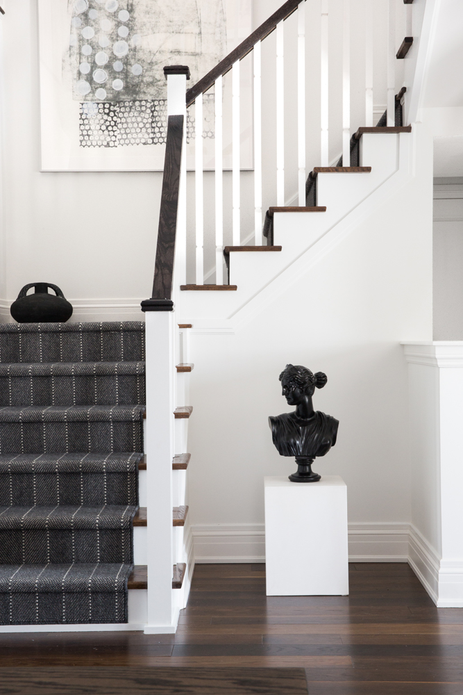
A Step Up
“This runner was an essential component for me,” says Sabrina. “It’s simple and graphic, yet neutral and high-performance. The staircase’s contrasting palette is a classic element that I added amongst the modern detailing.” And the eye-catching bust on the pedestal? “I just thought it was a neat element that would accent that nook in an unexpected and artsy way.”
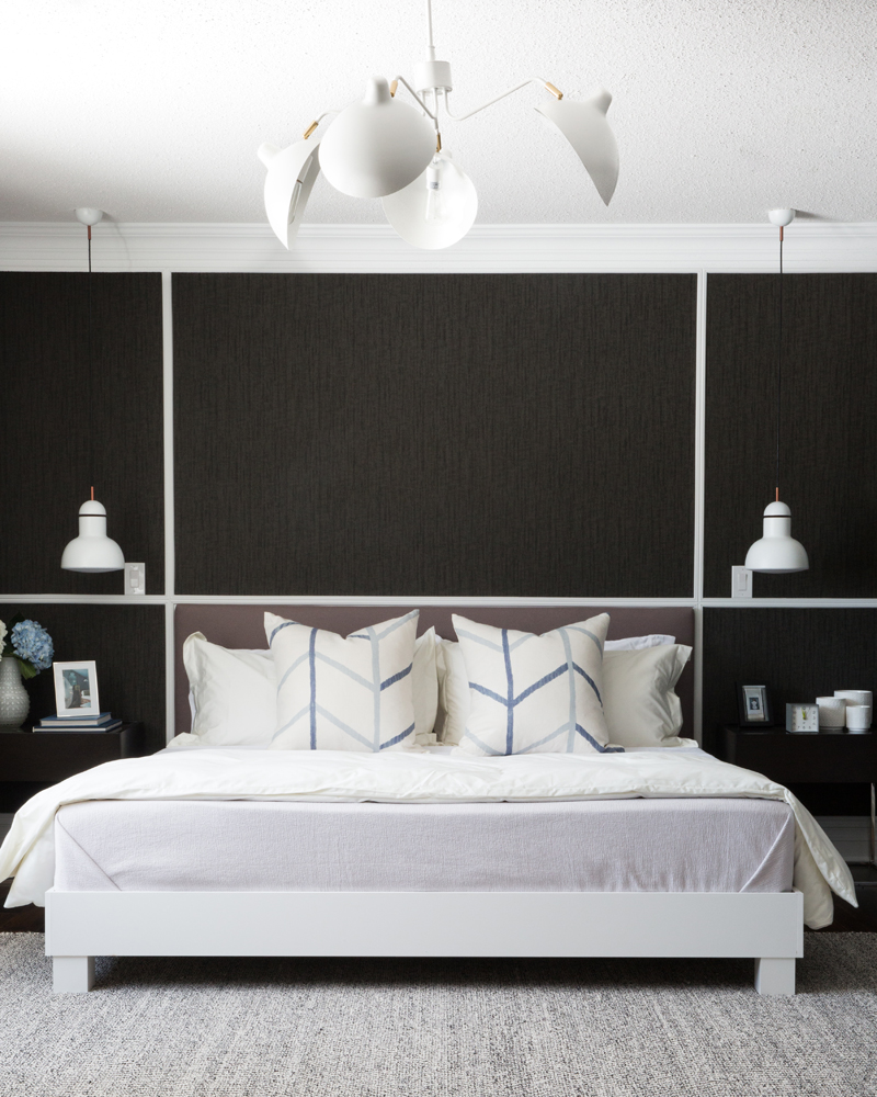
Expert Panels
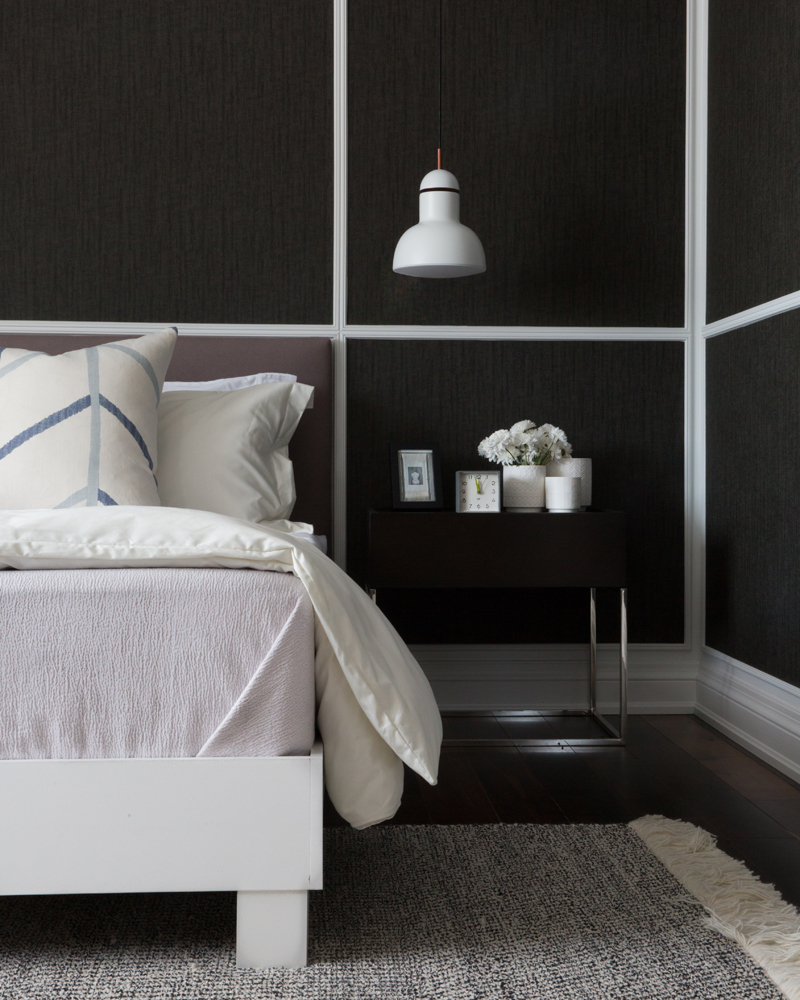
“I elevated the once-plain walls of the master bedroom by applying white trim and dark, textured wallpaper,” says Sabrina. It’s a savvy way to transform a bedroom, and we love the various ways it could be reinterpreted to suit any taste in terms of colour, pattern and style. “The chandelier and Anglepoise sconces feel unique here and are unexpected and striking at the same time.”
Side Kick
“Because I wanted the master bedroom to be modern and chic, I kept the nightstands open and minimal,” says Sabrina. This allows the sconce to be the focus. The graphic cushions are crafted from linen by Christopher Farr Cloth.
Black and White Magic
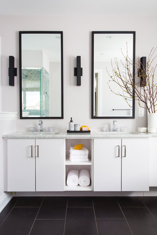
Sabrina designed the master ensuite to act as an aesthetic extension of the bedroom. “The dark tiles were selected to carry on the bedroom’s contrasting dialogue in this space.” She opted for a floating his-and-hers vanity and open storage for a minimal look that eschews heavy cabinetry.
Wall to Wall
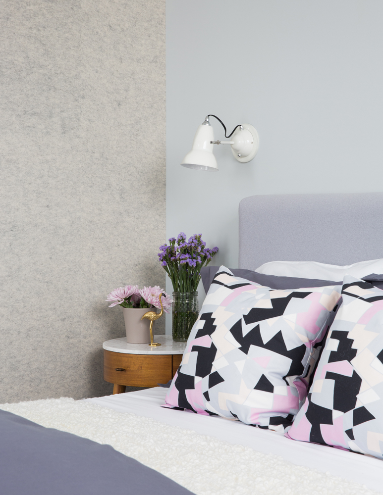
When it comes to adding texture to a bedroom, most think of blankets and area rugs. Sabrina thought of wallcoverings. “This grey felt wallcovering in the guest bedroom is not only beautiful, it’s soundproof and has such a comfy texture. That idea of introducing lots of texture was key throughout the home.”
Pretty Palette
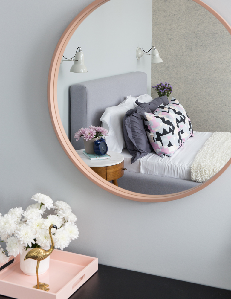
Soft lavender walls and bedding, a pink mirror and tray, a gold flamingo… These dreamy accents are anything but sleepy thanks to a mix of straight and curved lines and a couple of graphic cushions. “I wanted to keep the mood playful here and these colours and patterns do that,” says Sabrina.
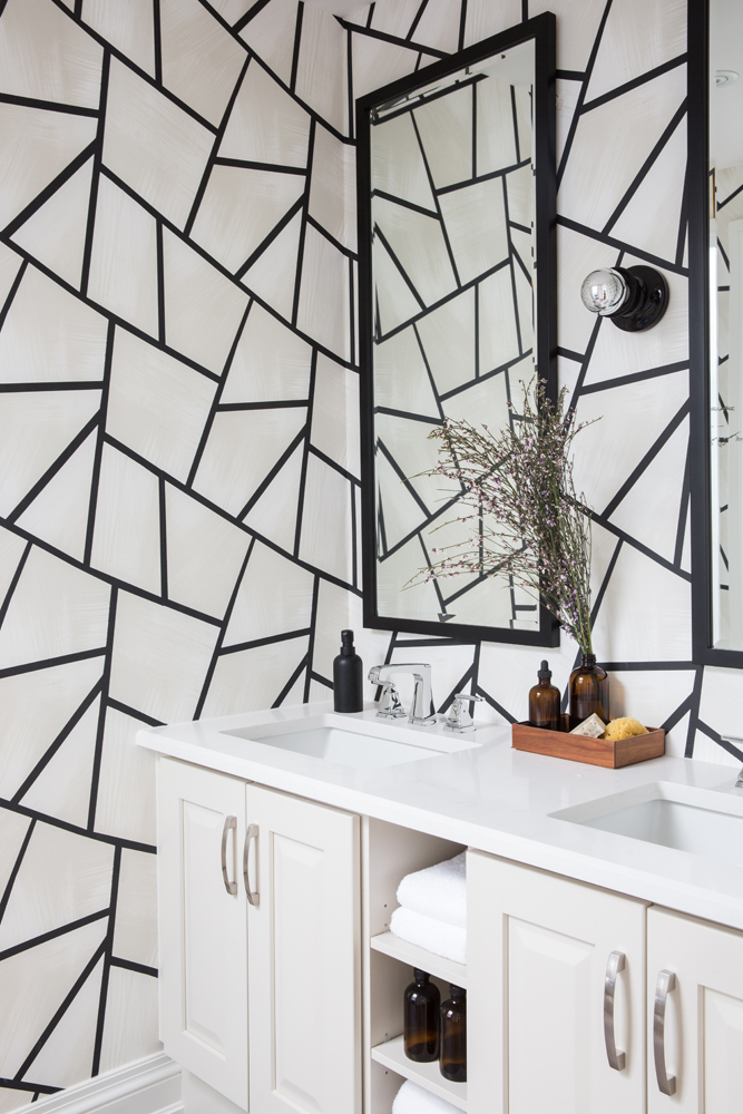
Oncoming Graphic
In this bathroom, Sabrina did what many designers and homeowners do with a small space: have fun with it! While this graphic wallpaper maintains the cool colour palette, it is pure fun. Obsessive detail: we love how the soap and lotion containers carry on the colour scheme.
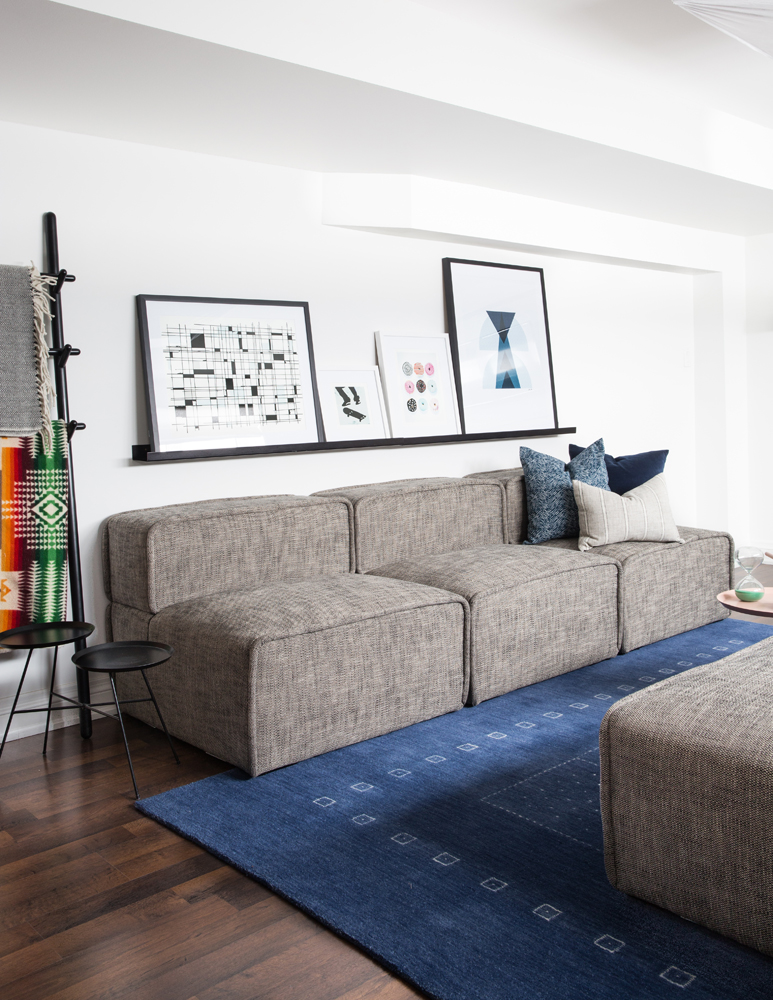
Kid- and Adult-Friendly
“This grey sofa is in the TV/ping pong area of the basement,” says Sabrina. “It’s where kids can play games and showcase their art.” It’s also so well designed that adults will love to spend time here watching a movie while curled up with a blanket, thoughtfully displayed on a ladder shelf.
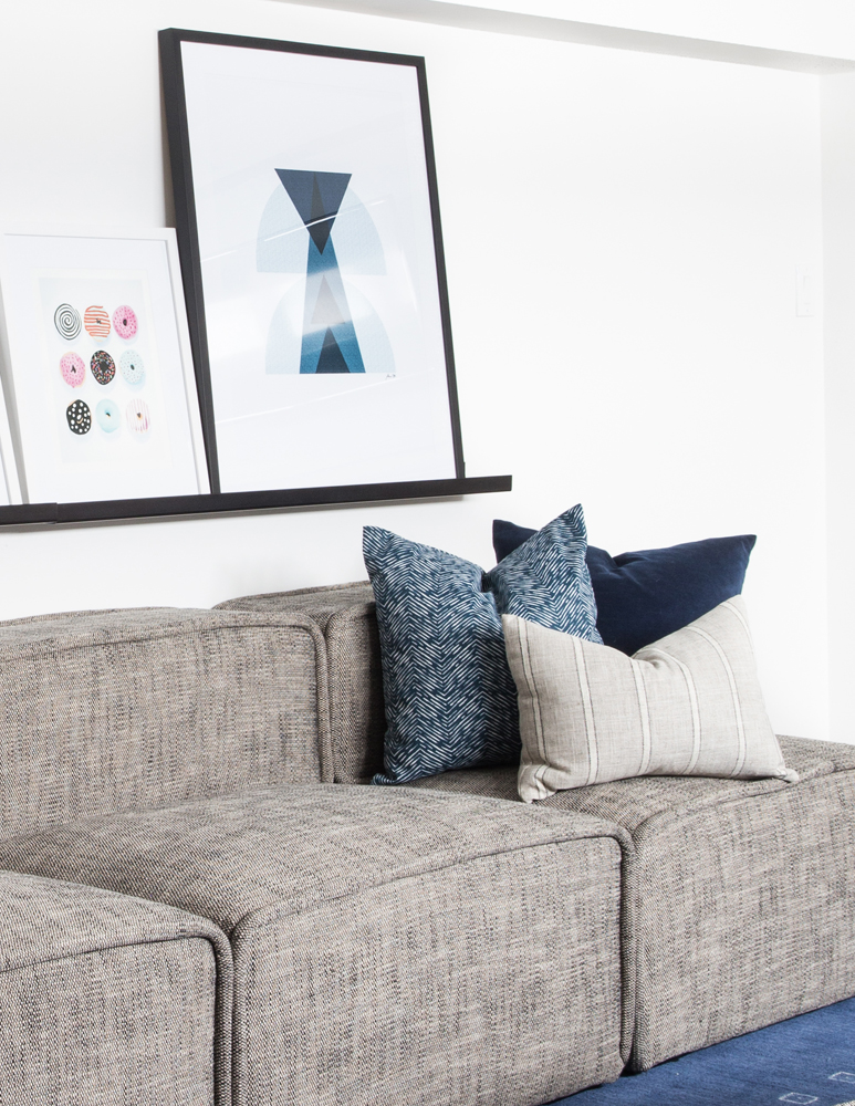
Shelf Improvement
We love the slim profile of this floating shelf, which Sabrina chose as a way to display artwork or kids’ drawings. It’s a super-easy way to style pictures in any room.
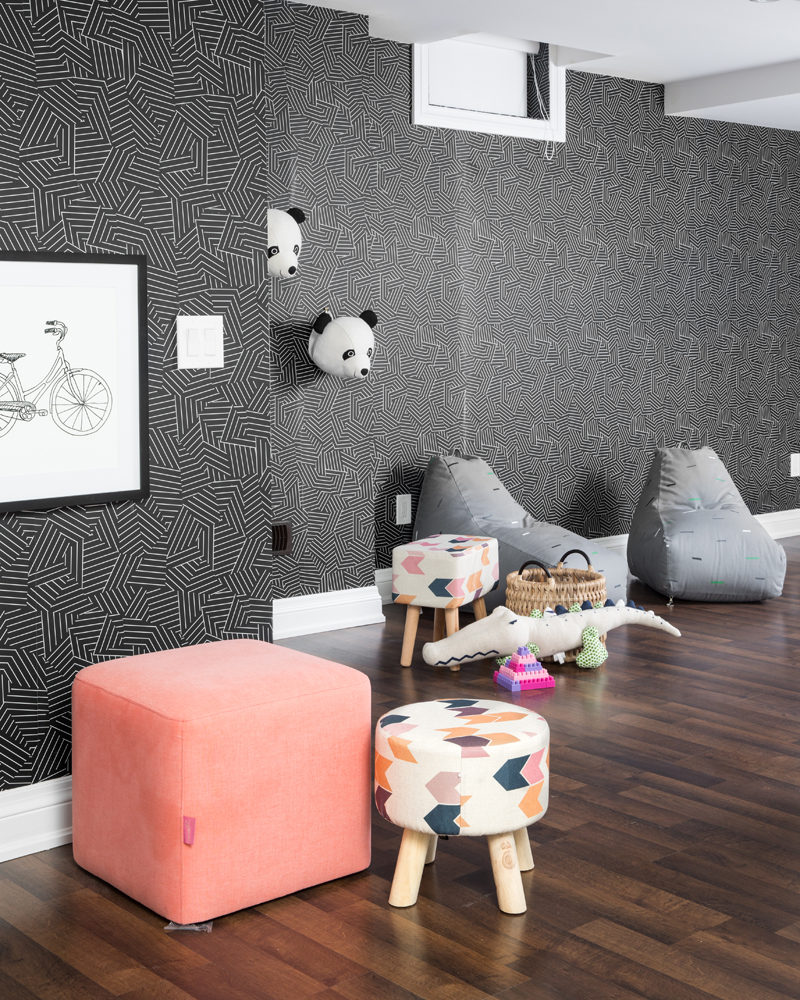
Up Against the Wall
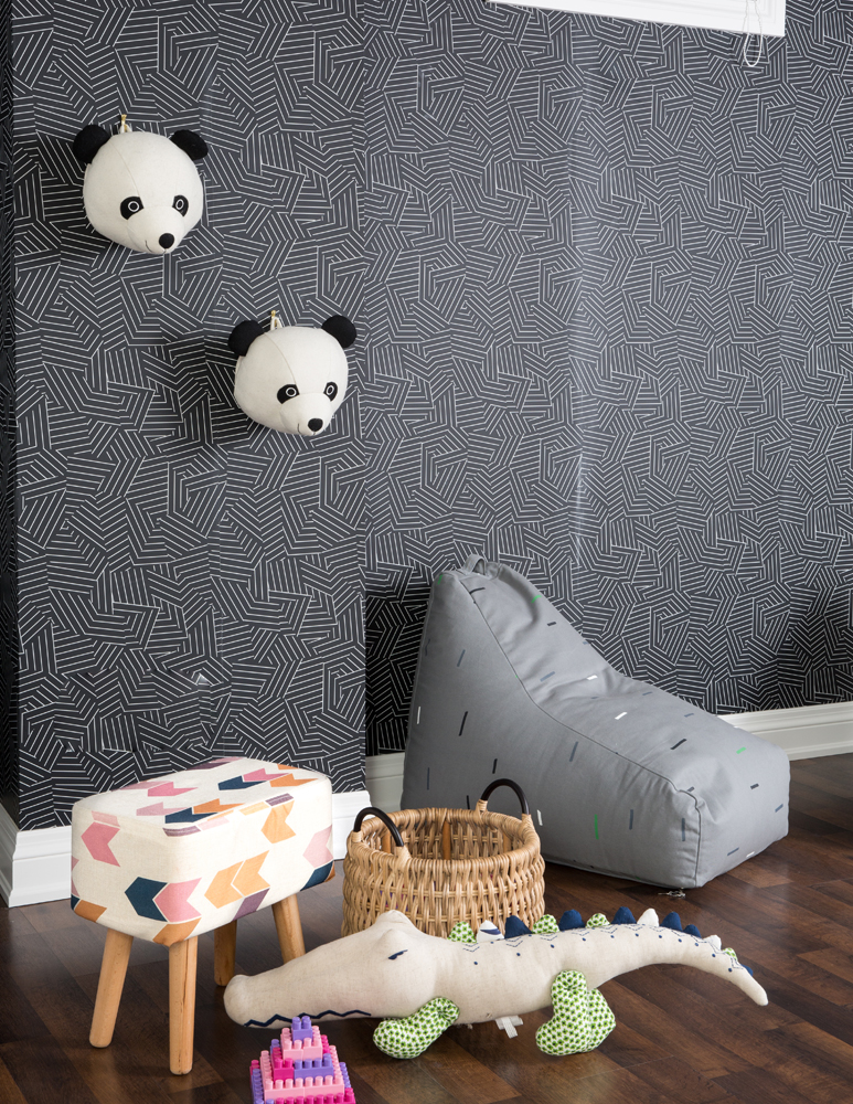
Once again Sabrina upends the idea of what playroom walls should be by using dramatic wallpaper. “This is Deconstructed Stripe by Schumacher and it is one of my favourite papers. It is so fun and can be used in any style of room – even a basement playroom.”
Just Imagine
Sabrina designed the playroom with potential viewers of the property in mind. “Panda heads and drawings are cute details to attract young purchasers as they walk through the model home,” she says. “Bean bag chairs (great for mobile reading nooks) and the colourful stool help define one area where children can run and explore.”
HGTV your inbox.
By clicking "SIGN UP” you agree to receive emails from HGTV and accept Corus' Terms of Use and Corus' Privacy Policy.


